Project Type : Personal Project
Roles : UX Designer, UX Researcher, and UX Writer
Timeline : 2 Months
Overview
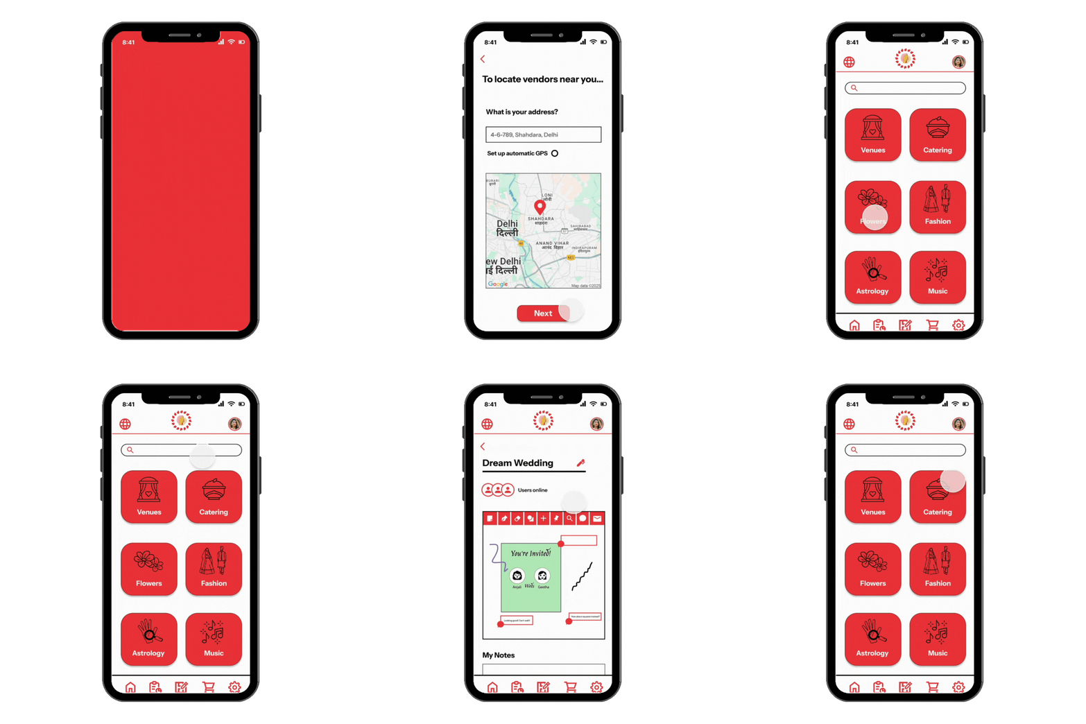
Wedeezy is a digital wedding planner app that aims to streamline the process of planning an Indian wedding. The app gives users increased control and flexibility—from choosing vendors and managing budgets to crafting AI-generated checklists and mood boards for inspiration.
The Problem
Indian weddings are vibrant, but can sometimes be overwhelming to plan. Additionally, brides and grooms are not always the ones spearheading the planning due to cultural norms that emphasize the role of the community/group. There is a need for a solution that offers soon-to-be-weds freedom and personalization in the planning process while keeping the magic of traditional marriages alive.
Empathize — Understanding the Challenge
1
User Research - Interviews
To gain deeper insights into the needs of Indian brides and grooms, as well as the unique values they associate with wedding planning, I conducted 5 semi-structured interviews (3F, 2M), 4 of which were online and 1 in a face-to-face setting.
Based on the stories shared by the interviewees, I crafted two user personas:


The main wedding planning needs I deduced from my user research were:
• Balancing personalization and collaboration in the planning process
• Clarity and visibility when it comes to scheduling and budgeting for weddings
• Learnability and communication when working with vendors
2
Competitive Analysis
After learning about my target users' needs and goals, I wanted to educate myself on current wedding planning tools that were available in the Indian market. I specifically focused on mobile apps due to their on-the-go coordination options and popularity among Indian users.

The competitive analysis revealed the following points:
• Although India is home to a diverse range of languages, all apps seemed to provide their services and tools in English, seemingly targeting English-speaking brides and grooms. The branding and account setup also seemed to highlight heterosexual marriages
• Almost all apps included tools for inspiration and creation, but the collaboration features were limited
• All apps offered resources to connect with vendors, which is crucial for users' discoverability
Evaluate — Strategizing and Designing
The Empathize stage gave me a clearer picture of both the users' needs and what the market currently had to offer. Now, I decided to draw on Designer Peter Moreville's framework, the "UX Honeycomb", to curate a wedding planning experience that could be:
Ideation and Paper Prototyping

To brainstorm some potential features and tools I could include in the mobile app, I did a variation of the Crazy 8's design exercise by timing myself as I worked on 20 different sketches of how the app could fit into a user's planning experience.


By the end of the exercise, I was able to strategize some planning tools that could allow for both collaboration and customization. These included an AI-powered checklist creator to get users started, a wedding status tracker, and a collaborative whiteboarding tool to design materials like invitation cards and posters.
I also began envisioning the app under the name "Wedeezy", directing focus to its goal of simplifying the wedding planning process. To test out my initial user flow, I made paper prototypes for an interactive yet minimal feel.

These were the key findings from my informal paper prototype test:
• Location set-up should be separated from the account set-up screen, as participants wanted the option to visually pinpoint their address, and many did not even notice the option to save their location
• Some of the instructional text for the reminders and checklist needed to be more concise
• All participants identified what each component/box was meant for using the icon sketches, showing me the importance of iconography
Lo-Fidelity Prototyping

After coupling the feedback I received from the participants with gaps I identified, I created Lo-Fidelity prototypes emphasizing visual hierarchy, accessibility, and navigation.
These were the main improvements I aimed to incorporate in the Hi-Fidelity version:
• Designing an intuitive bottom navigation bar for greater flexibility and efficiency
• Allowing for increased error control by including back buttons throughout the onboarding frames
• Rewording "Supplier" to "Vendor" for more clarity and alignment with the wedding context
• Offering users the option to change the language after making an initial selection
Hi-Fidelity Prototyping

Figma Link:
Key visual design and branding elements:

The logo captures elements symbolizing Indian culture. The gesture with two palms together conveys respect and hospitality, while the flower petals reflect festivity.
The color palette is simple yet evocative. Pink is linked to bridal wear and flowers, while black and white add balance to the UI. I chose Instrument Sans for its clean and legible style.


For cultural relevance, I sourced the icons from artists on The Noun Project. This helped me save time and maintain consistency. All artists are credited in the comments on my prototype.

To offer users increased flexibility and efficiency, I designed a bottom navigation bar with five main icons, each linked to a core page within the app.
Empower — Reflect and Iterate
Lessons Learned
Working on this project has encouraged me to explore the unique meanings and ties associated with Indian weddings and translate them into an engaging app for users to plan their weddings hassle-free.
As the Fall semester started to ramp up, I was unable to carry out further usability testing with Indian users. However, this experience taught me so much about empathizing with users and the need for balancing expectations with practical design constraints. I look forward to revisiting Wedeezy in the future to refine it based on real-time user feedback!
Wedeezy Walkthrough


