HIRA - Website Design + Re-Design
Project Type : Freelance Project (Contract)
Role : UX Designer
Timeline : Phase 1 - 1 day, Phase 2 - 3 months
Overview
HIRA is an AI-powered staffing office that streamlines decision-making for hospital middle managers.
This project includes two phases of design work. The first was a rapid one-day build of an anchored single-page site, while the second was a redesign of the site with multiple sub-pages.
The Problem
Phase 1:
The clients were preparing to present HIRA's pitch deck at a conference and urgently needed an online presence to connect with potential investors.
Phase 2:
HIRA had been gaining traction since the conference, so the clients reached out to me a few weeks later to help redesign and expand their website to ensure it better reflected their services and identity.
Empathize — Understanding the Challenge
1
Phase 1 - Pitch Deck Analysis
Given the one-day deadline for the initial version of the site, I mainly relied on the pitch deck the client shared with me and communicated with the clients online to ask them questions about the company's goals and target audience (investors, at this stage).
I decided to highlight these elements based on HIRA's current need for an online presence:
Challenges faced by
Middle management
HIRA's solution (services + process)
Contact section
and CTA buttons
2
Phase 2 - Meeting the Clients + Setting the Roadmap
In our first meeting, the clients shared their updated pitch deck and an overall branding document. After discussing their needs, we noted the following objectives:
• To provide more context around the services HIRA offered and establish a stronger online presence to support their outreach efforts, particularly on spaces like LinkedIn
• Apply a minimalist and clean style for the site with clearly organized content sections
• Keep the language consistent across all platforms, as I would be working in coordination with the Marketing team
We used Monday.com to track progress and keep ourselves aligned with deadlines and dependencies.
Evaluate — Strategizing and Designing
Phase 1
Since our goal was to produce an MVP version of the site, I decided to use Wix and restructure an existing template to save time. I then sketched out a rough layout for the overall site structure.

Logo
CTA
Mission
Services
Anchored content
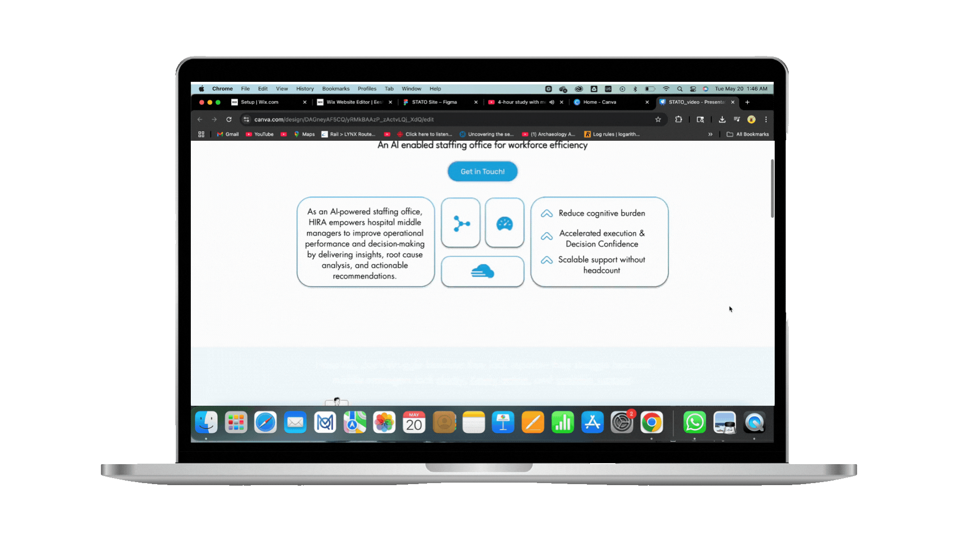
Due to the limited content during the initial phase, I opted for a single-page anchored layout to help users access all the key information quickly in a scrollable format.
Hi-Fidelity Prototyping
I chose to skip Lo-Fidelity prototyping at this stage and fully focused on developing each section of the site at a Higher fidelity using colors, iconography, and visuals from the pitch deck.
Hero Section

• I used a striking shade of blue for the CTAs and a gradient background for the hero section to make it stand out as the first point of engagement
• As for the iconography, I considered HIRA's core offerings from the deck:
Resource Augmentation, Enhancing Workflow, and GenAI
Mission Section


• For the content, I emphasized metrics and HIRA's value proposition with visuals that aligned with a hospital setting
• The bottom of the header turns blue as the user scrolls to create neatly divided sections and increase legibility
Services Section


• To keep this section concise, I prioritized visuals by selecting icons from Wix's library resonating with the three services HIRA offered: Resources, Intelligence, and Workflow
• The pitch deck contained a dense slide on how HIRA operates, so I decided to break it down into a 4-step flowchart to make it simpler for users to digest
Contact Section

• Both CTAs lead to this section when clicked, and the inclusion of a back-to-top button on the bottom right allows for increased accessibility
• The form is simple and only includes 3 input fields to reduce friction
Key visual design and branding elements:


Previous logo
My Redesign
I used Canva to create a logo that aligned with the medical space using a vital signs graph as the tittle/dot on the "i" in HIRA

The color palette I used in the site referenced the pitch deck and remained fairly simple due to time constraints
Phase 2
For the redesign of the website, our approach was more structured, with each design component built piece by piece and iterated based on feedback from the clients.

First Site Layout

Final Site Layout
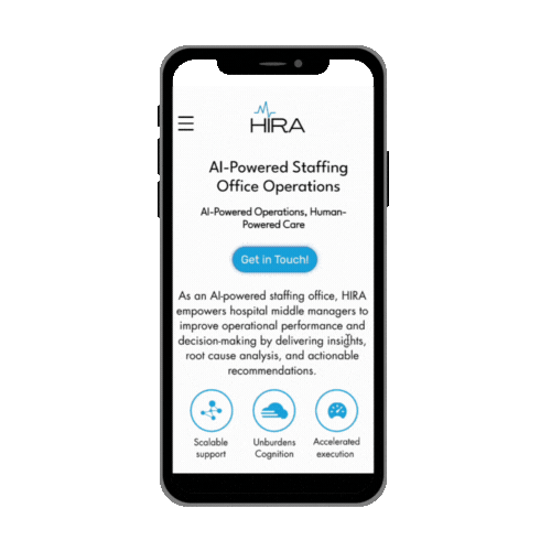
Hero Section
• I shared two designs of the hero section with the client to get their thoughts
• We settled on Version B, which included a bento-style design with rounded rectangles containing key information about HIRA for users to take in at a glance
Version A
Version B


CTAs and Forms
• After presenting variations of the CTA button to the clients, they ended up selecting the blue design. For wording, we decided to use "Connect" for the navbar and "Get in Touch!" for the hero section CTA
• The form was created in Figma according to the client's requirements


Site Graphics
• After identifying the visuals we wanted to include from the updated pitch deck, I redesigned them on Figma while referencing the site's branding palette


Final Hi-Fidelity Prototypes
After finalizing our site map and having the key visual and branding components ready, I worked on translating the designs and new pitch deck content onto the final Wix site.
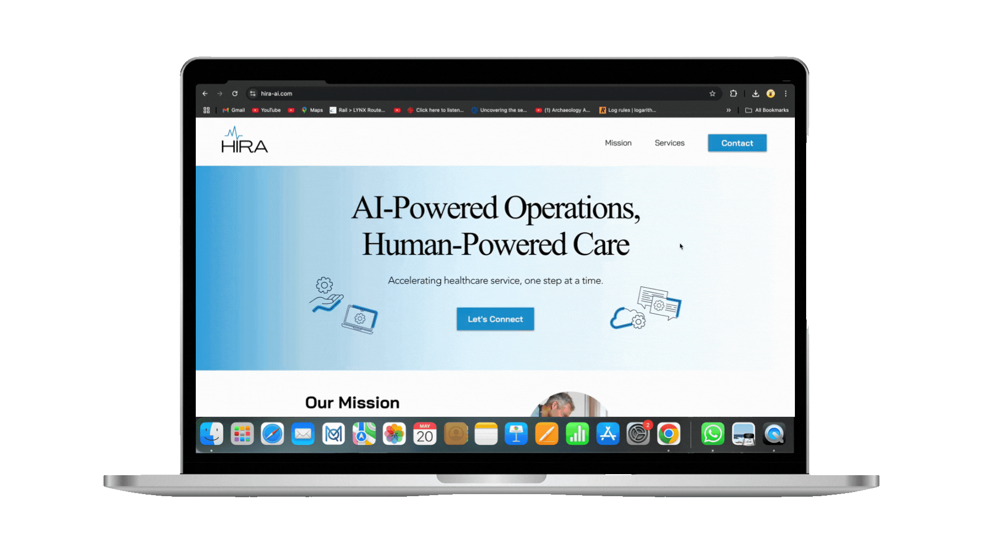
Home Page


About Page


Alpha Program Page


With hover effect
Contact Page
The CTAs are all connected to the contact section on the home page using an anchor.
Key visual design and branding elements:

Since the clients liked the
redesigned logo from Phase 1, it was included in the updated version of the HIRA site and other marketing materials
For the site's typography, I used these fonts for a modern and minimalistic look:
Headers, 60 px
Body text, 20 px
CTAs, 18 px

The expanded site used colors from the clients' branding document
Empower — Reflect and Iterate
Lessons Learned
Having the opportunity to redesign my own work helped me recognize the importance of scalability and being adaptable according to changing business needs/goals.
I also learned that it was important to step out of your comfort zone to try out new workflows. Designing individual elements step-by-step was new, but it helped me save time and maintain consistency across the site.
HIRA Walkthrough
HIRA Website Link:
Phase 1
Phase 2