Project Type : Contract (Remote)
Roles : UX Design Intern
Timeline : 4 Months
Overview
STATO Solutions is an analytics recruiting service that connects businesses with the right candidates for their needs. I met the clients consistently over 4 months to translate their vision into a clean and intuitive website to enhance user engagement and promote brand visibility.
The Problem
As a startup, STATO Solutions needed a strong site that could effectively convey its value proposition and services to businesses and collaborators. Their previous site was made using a template, and there was a clear need for improved visual design, branding, and a logical information hierarchy.
Empathize — Understanding the Challenge
1
Meeting the Clients
In our Zoom meeting, the clients shed light on the company's mission and shared a pitch deck packed with insights on their business goals and value proposition.
These were the main takeaways:
• Highlighting STATO's key operational pillars to gain user trust
• Sticking to Wix as the clients purchased a paid plan on the platform
• Maintaining visual consistency with the color palette of their previous site
• "Analytics" as a core theme for branding (Even the name "STATO" was linked to Statistics)
2
Analyzing the Current Site
Before our next meeting, I looked into Wix's inbuilt analytics dashboard to identify areas for improvement in the user flow. After testing out datapoints like page visits, time spent on sub-pages, and navigation through informal usability tests, I presented my findings and a suggested user flow.
I also included some new logo designs that better aligned with their branding.

Evaluate — Strategizing and Designing
Now that I had enough context about the client's end goals, I brainstormed a site map with three main pages to highlight STATO's main offerings while ensuring that we met our timeline.

Lo-Fidelity Prototyping

Home Page
Services
Mission
Contact

1
3
2
4
Home Page Layout
1. Clean organization of the navbar with the logo and three main pages
2. STATO's main features are highlighted at the very top with three guiding visuals
3. A testimonial to strengthen credibility
4. Compact contact section with an estimated response time to set clear expectations for users
Services Page Layout
1. Bolded and underlined text to identify which page the user is on
2. Brief introductory paragraph to pitch STATO's main purpose to its users
3. Circular icons with connected labels to create a clear visual hierarchy
1

2
3

1
2
3
Mission Page Layout
1. Opening sentence to empathize with businesses and an introductory paragraph about STATO's mission
2. A circular graphic on the right to maintain consistency and create balance
3. Organized layout of STATO's three core values using rounded rectangles
Contact Page Layout
1. Brief introduction with a reminder for the estimated response time
2. Enlarged version of the Home page's contact section to maintain consistency

2
1
After sharing the designs with my clients and going over updated site needs, we noted these points for the next iteration:
• Instead of highlighting STATO's features in the three circles on the home page, we would include the top three roles they were targeting to recruit (i.e., Data Analysts, Data Scientists, and BI Developers)
• The analytic branding style needed to be more apparent
• The site needed to adopt the blue-toned palette reflected in the company's pitch deck
Hi-Fidelity Prototyping
The Hi-Fi design of STATO's site was intensively iterative and involved multiple rounds of client feedback. To streamline the design process early on, I presented 2 distinct versions of the home page—each with varied logos, typography, and color schemes to help articulate their design preferences.
Version A
Version B


We eventually settled on Version A, which featured a white and blue color palette, Poppins font, and a logo that emphasized STATO's statistical and data-centric identity with a pie chart as the "O".
However, there were a few changes my clients suggested that guided the refined design:

1
2
1. Replacing the content in the circles with four of STATO's key drivers instead
2. Restructuring STATO's contact section by grouping the input fields and positioning contextual text externally
As I started translating my Figma designs into a functional website, I quickly realized that there were improvisations I had to make due to Wix's design constraints, such as the inability to add gradient borders and resizing issues.
Furthermore, the clients wanted to have 2 separate contact sections to promote their recruiting services and invite businesses for collaborations. This led to a redesign with two rounded containers resembling the style of the home page's contact section for visual consistency.
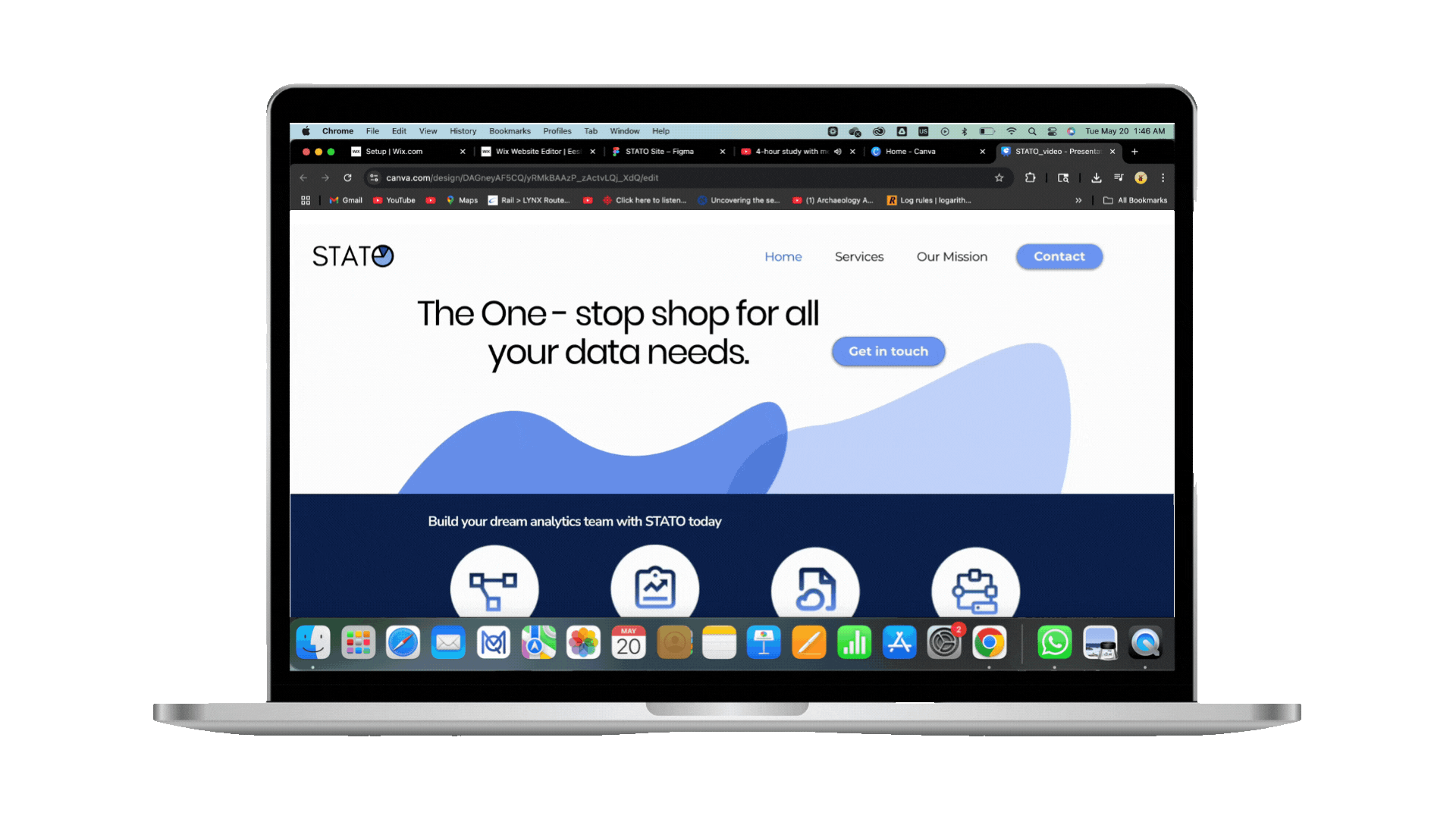
Final Wix Designs
Home Page


• After reviewing the updated pitch deck, the final features we included were: Project Management, Report Automation, Cloud Migration, and Data Architecture
• Resolution and size constraints prompted plain text for the testimonial and enlarged quotation marks as subtle visual anchors for accessibility
• The CTA button was repositioned to make better use of the whitespace
Services Page
• Since the clients wanted to include the features on the Services page too, I used a pyramid structure to show users the hierarchy of STATO's skillset
• I organized the "STATO's Process" visuals in a grid-like structure for a balanced layout


Mission Page


• I translated STATO's value proposition into a concise statement through clear UX writing
• I also added iconography that aligned with the mission statement:
-> A hand holding gear symbols to reflect support for businesses
-> Network icons to symbolize collaboration
Contact Page
• The contact page includes two separate boxes targeting collaborators and businesses
• The shape of the boxes and typography match the Home page's contact section. The visuals have also been carefully chosen to complement each target audience


Key visual design and branding elements:

The logo reflects STATO's analytical branding. The pie chart as the "O" was incorporated after the client shared that the company name was inspired from statistics
For the site's typography, I used the following fonts for a clean, bold, and tech-friendly look:
Headers, 50 px
Sub-headers, 20 px
Body text, 18 px

The color palette for the site aligned with STATO's pitch deck, reflecting calmness and reliability
Empower — Reflect and Iterate
Lessons Learned
As my first freelance project, working on STATO's website gave me a lot of valuable insights into striking a balance among client needs, my own design interpretations, and potential technical constraints. The biggest takeaway I have is to always be prepared to both communicate and iterate during the process.
Working with clients is meant to be a collaborative process where the designer tries to strategize creative solutions to overcome challenges and ensure that the company's voice is not only heard, but also elevated through thoughtful and impactful design decisions.
STATO Walkthrough